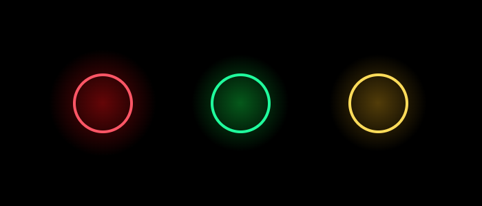
こんにちは、TaKO8Kiです。 TwitterのTLに綺麗なネオンデザインの画像とカラーコードが流れてきたので、CSSで書いてみました。
カラーコード置いときます😊 pic.twitter.com/lPNTyNh1LJ
— ひかる (@engineerHikaru) August 13, 2020
最終的にこんな感じに出来上がりました。ツイートの画像にそれなりに近いものになったと思います。
HTML、CSSはこんな感じです。多分綺麗には書けてないです。
<div style="display: flex;">
    <div class="container">
        <div class="red-circle"></div>
        <div class="red-shadow"></div>
    </div>
    <div class="container">
        <div class="green-circle"></div>
        <div class="green-shadow"></div>
    </div>
    <div class="container">
        <div class="yellow-circle"></div>
        <div class="yellow-shadow"></div>
    </div>
</div>
.container {
    position: relative;
}
.red-circle {
    width: 80px;
    height: 80px;
    border-radius: 50%;
    background: transparent;
    border: solid 3.5px #FF5161;
    top: 56.5px;
    left: 56.5px;
    position: absolute;
    z-index: 100;
}
.red-shadow {
    background-color: #333;
    background-image: radial-gradient(#D30302 -60%, #000 55%);
    line-height: 300px;
    text-align: center;
    width: 200px;
    height: 200px;
}
.green-circle {
    width: 80px;
    height: 80px;
    border-radius: 50%;
    background: transparent;
    border: solid 3.5px #00FE9B;
    top: 56.5px;
    left: 56.5px;
    position: absolute;
    z-index: 100;
}
.green-shadow {
    background-color: #333;
    background-image: radial-gradient(#02C435 -60%, #000 55%);
    line-height: 300px;
    text-align: center;
    width: 200px;
    height: 200px;
}
.yellow-circle {
    width: 80px;
    height: 80px;
    border-radius: 50%;
    background: transparent;
    border: solid 3.5px #FFDB4E;
    top: 56.5px;
    left: 56.5px;
    position: absolute;
    z-index: 100;
}
.yellow-shadow {
    background-color: #333;
    background-image: radial-gradient(#B48505 -60%, #000 55%);
    line-height: 300px;
    text-align: center;
    width: 200px;
    height: 200px;
}
最近フロントエンドに触れてなかったので、新鮮で楽しかったです。